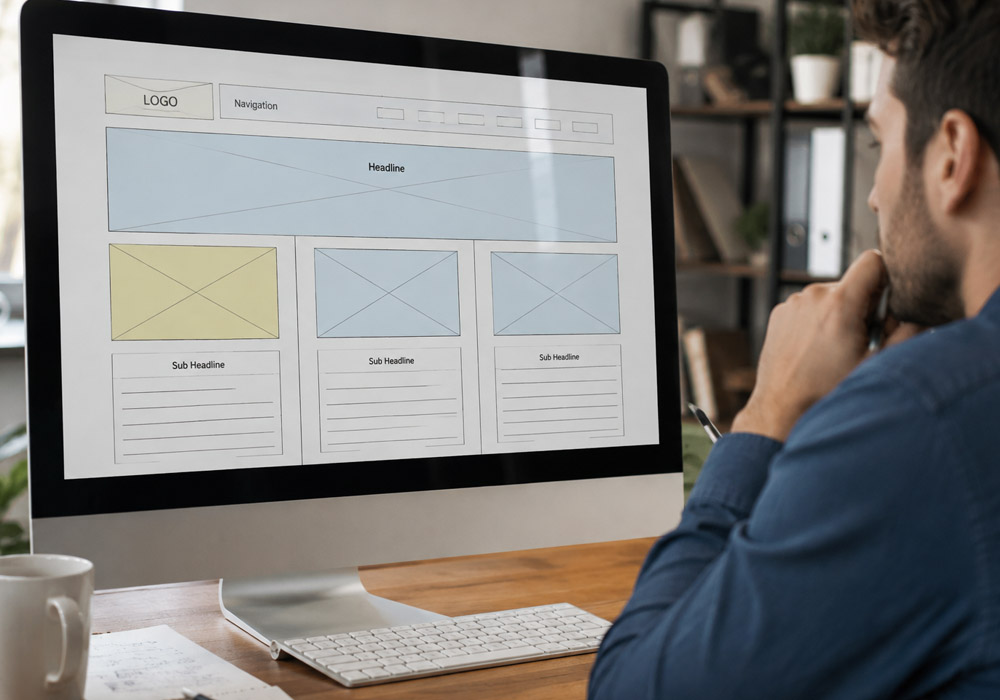
A clear website layout helps visitors understand content, move between sections, and find important information without unnecessary effort. When pages are well organized, users can follow the visual structure naturally and interact with content more confidently. Flexible layouts are equally important because websites need to work across different screen sizes, devices, and content types. Using a thoughtful structure from the beginning can make a design easier to maintain while creating a more consistent experience for visitors.
Grid systems can provide a practical foundation for building this type of layout. By arranging text, images, navigation elements, and other components within a defined structure, designers can create balance without making pages feel rigid. Exploring real-world grid UI examples can also help designers understand how different websites use columns, spacing, alignment, and responsive structures. These references can provide useful ideas for creating layouts that remain organized while adapting to changing content and screen dimensions.
Why Website Layouts Need More Flexibility
People move between phones, tablets, laptops, and large monitors throughout the day. A page that feels balanced on a wide desktop can become crowded or confusing on a phone if its structure depends on fixed widths, tightly packed columns, or oversized decoration. Flexibility allows the page to preserve its purpose as the available space changes.
Layout decisions should support the page goal. A portfolio needs work to be easy to browse. A service page needs to build confidence and make it simple to contact the business. A publication needs readers to compare stories quickly. Visual personality matters, but it should not make navigation harder or hide the information visitors came to find.
Start With The Page Goal
Before choosing columns or colors, define the page’s main action. This may be reading an article, viewing a product, requesting a quote, subscribing, or comparing options. Then identify the information a visitor needs to act confidently.
- Put the primary message near the beginning of the page.
- Separate essential information from helpful but secondary details.
- Give the main call to action a clear label and a distinct visual treatment.
- Remove sections that compete with the page’s core purpose.
Build A Simple Content Hierarchy
Hierarchy tells visitors what deserves attention first, second, and later. Use a meaningful page title, clear section headings, concise supporting copy, and grouped related elements. Not every item needs to be large or bold. When everything demands attention, nothing stands out.
- Place the most important message in an obvious position.
- Use heading levels consistently so the page has a logical reading path.
- Keep explanatory text close to the image, form, or feature it describes.
- Use contrast selectively for key actions, alerts, and priority content.
- Give secondary links less visual weight than the main action.
Choose The Right Layout Structure
A layout grid is a framework, not a cage. The history of grid-based design shows how grids have long helped organize text and images into patterns people can absorb quickly. On the web, the same principle gives teams consistency while allowing each page to serve a different content need.
Common Structures And Their Best Uses
- Single-column layouts:Best for articles, guides, checkout flows, and focused landing pages where reading order matters.
- Two-column layouts:Useful when the main content needs a supporting panel, such as filters, related details, or a booking form.
- Multi-column layouts:Helpful for catalogs, archives, dashboards, and story collections that benefit from comparison.
- Split layouts:Effective when an image and a message deserve similar attention.
- Asymmetrical layouts:Useful for emphasis, provided the reading path remains clear.
Use Spacing As A Design Tool
Whitespace is not wasted space. Margins, padding, line height, and gaps help people recognize which elements belong together and where one idea ends. Use smaller gaps inside a group, such as between a card title and description. Use larger gaps between unrelated sections to create a natural pause.
Spacing also protects readability. Avoid narrow text blocks, crowded buttons, and cards that force every detail into the same small area. Check the page at smaller widths, where poor spacing becomes especially noticeable, and one extra line of text can upset the entire composition.
Design For Mobile Before Desktop
Mobile-first design encourages useful restraint. Start with the smallest practical screen, place the core message and action first, and decide what must remain visible. Columns should stack once they no longer provide comfortable reading widths, while supporting details can move lower in the page rather than competing with the main task.
- Make touch targets large enough to select comfortably.
- Keep labels clear instead of relying on unfamiliar icons alone.
- Test at several widths, including awkward in-between sizes.
- Check that menus, forms, and cards still work when text wraps.
Make Images And Cards Work Harder
Images and cards should clarify content, not merely fill space. Use consistent image ratios when visitors need to compare items, such as products or case studies. Use larger visual blocks for priority stories or featured work. Short labels and focused descriptions make a card collection easier to scan than dense blocks of repeated copy.
Test with real headlines, photos, prices, names, and descriptions. Placeholder content often hides problems that appear immediately once a real editor enters a longer title or uploads an image with an unusual crop.
Know When To Break The Layout
Perfect symmetry can feel calm, but it can also make a page forgettable. A large quote, image, or headline may extend beyond the standard content area to create a deliberate focal point. Editorial pages often use a structured, newspaper-style design to accommodate many stories while maintaining a sense of rhythm.
Break alignment sparingly. Keep navigation, body copy, and controls predictable, then return to the underlying structure after the visual moment. This gives the design energy without making visitors work harder to understand it.
Support Accessibility And Readability
- Use clear heading levels and readable text widths.
- Maintain a strong contrast between text, controls, and backgrounds.
- Do not communicate meaning through color or position alone.
- Leave enough room around links, buttons, and form controls.
- Check Zoom behavior, keyboard navigation, and logical focus order.
Test The Layout With Real Tasks
Do not judge a layout only by a polished screenshot. Ask someone to find a key fact, compare two options, or complete the primary action. Watch where they hesitate, scroll backward, or miss a label. Those moments reveal whether the structure is doing its job.
Common Website Layout Mistakes
- Using too many columns on small screens.
- Giving every section the same size and visual weight.
- Adding animation before resolving structure and readability.
- Making important buttons look like ordinary text links.
- Letting decorative imagery push useful content too far down the page.
- Copying a popular pattern without considering the audience or task.
Conclusion
A good website layout creates a clear path without forcing every page into the same pattern. Begin with a solid structure, adapt it to the screen and content, then introduce visual variety only when it improves emphasis or understanding. The best layouts help people read, compare, decide, and move forward with less effort.