Key Takeaways
- Start with the permanent finishes, natural light, and daily purpose of each room.
- Choose a connected color family instead of selecting every room in isolation.
- Test large samples in changing daylight and under your evening lighting.
- Use undertones, trim color, and sheen to create a deliberate flow.
- Use 2026 color trends as inspiration, not as rules that override your preferences.
A successful whole-home paint plan makes a Kansas City house feel connected without making every room look identical. Whether you live in a Brookside bungalow, a newer Overland Park-area build, or a historic home near the Plaza, paint has to work with changing Midwest daylight, existing materials, and the way your household actually uses each space. Homeowners considering interior house painting Kansas City, MO, can get better results by making color decisions before the first wall is prepared. The goal is not to follow one rigid palette. It is to create a visual thread from the entryway to the bedrooms, kitchen, and living areas. A calm neutral hallway, for example, can bridge a deeper living room color and a softer bedroom shade while still allowing each room to have its own personality.
Start With The Parts Of Your Home That Will Not Change
Paint is usually easier to replace than flooring, countertops, cabinetry, tile, stonework, or large upholstered furniture. Begin by photographing each room and noting the colors already present in hardwood, carpet, brick fireplaces, backsplashes, window treatments, and metal fixtures. Look closely at the dominant undertones. Honey oak often reads warm or golden. Gray tile may lean blue, beige, or green. A cream countertop can look yellow beside a stark white wall. The best wall colors support those fixed elements rather than fighting for attention against them.
Read The Light Before Choosing A Color
Lighting can completely change a paint color. North-facing rooms often receive cooler, softer daylight, while south-facing rooms usually receive stronger and warmer light. East-facing spaces tend to be brightest in the morning, and west-facing spaces can become warmer later in the day. Kansas City weather adds another reason to test carefully. A shade that feels bright and balanced on a sunny afternoon may look much grayer during an overcast stretch or more yellow under warm evening bulbs. Check samples near windows, in corners, beside trim, and next to major furniture during morning, afternoon, and evening.
Build A Simple Color Family
- Choose one main neutral for hallways, shared areas, or the largest connected spaces.
- Add one or two related supporting colors with compatible undertones.
- Select a richer accent color for a dining room, study, powder room, or focal wall.
- Repeat small color connections through artwork, rugs, pillows, or wood tones.
Visual rhythm matters more than exact matching. Current palettes provide useful ideas: warm, nature-inspired colors for 2026 include earthy greens, browns, creamy neutrals, muted yellows, and grounded red-brown tones. Use those directions as a starting point, then choose shades that suit your home’s materials and your comfort level.
Choose Colors By Room Function
Living Rooms
Living rooms need flexibility because they are used at different times of day and often contain several furniture finishes. Warm off-whites, soft taupes, muted greens, and balanced beiges can create a welcoming backdrop. In a large room, a deeper tone can add definition and make the space feel more grounded.
Bedrooms
Bedrooms generally benefit from low-glare colors that feel restful in both daylight and lamplight. Muted blue, dusty green, clay, taupe, and warm off-white are practical options. Avoid choosing solely from a paint chip, since a subtle undertone can become much stronger across four walls.
Kitchens, Dining Rooms, And Bathrooms
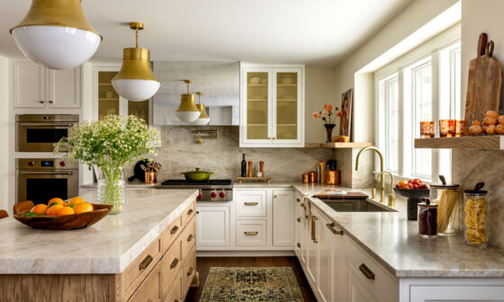
In kitchens and dining spaces, compare paint directly with cabinets, counters, flooring, and appliances. If you want stronger color, consider using it on walls around neutral cabinets or in a dining room rather than covering every connected surface. In bathrooms, test beside tile, mirrors, white fixtures, and vanity finishes because reflective surfaces intensify surrounding color.
Hallways, Stairways, And Transitional Areas
These areas are often the best place for the home’s connecting color. A dependable neutral can make doorways and sightlines feel intentional, especially in homes where several rooms are visible at once. Ceiling and trim choices also matter. A lighter ceiling can help preserve an open feeling, while coordinated trim can soften transitions between rooms.
Use Undertones To Prevent Clashes
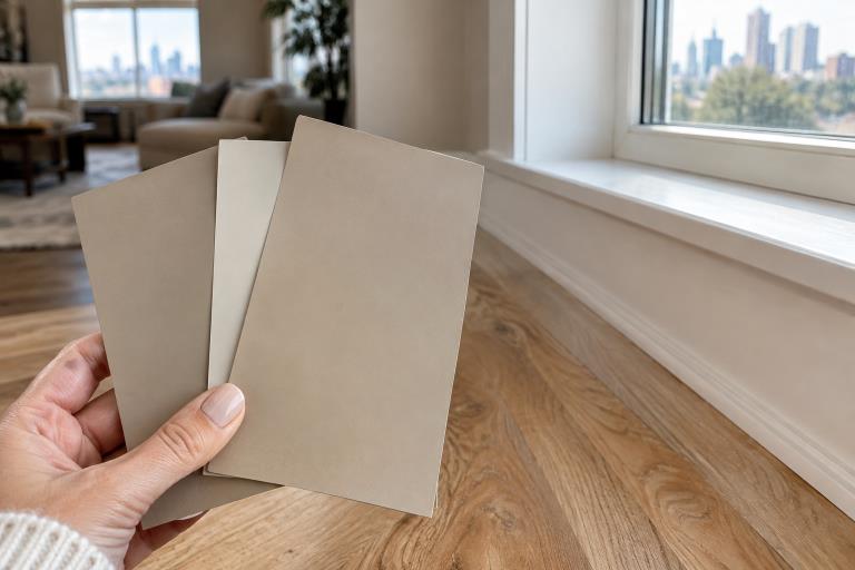
An undertone is the subtle color beneath the main color you notice first. White can lean creamy, gray can lean blue or green, beige can lean pink or gold, and taupe may contain gray, violet, or brown notes. Two colors that appear nearly identical on small chips can look unrelated once each covers a wall. For example, a cool blue-gray may feel disconnected beside warm red oak flooring, while a warmer greige may create a smoother transition. Place samples side by side with flooring, counters, trim, and cabinet doors before deciding. This simple comparison catches many expensive mistakes early.
Sample Paint The Right Way
- Use large sample boards or poster boards instead of relying on tiny paint chips.
- Apply two coats so the sample reaches its intended depth.
- Move boards around the room and hold them beside fixed finishes.
- View them in natural and artificial light.
- Leave them up for at least a full day before committing.
Avoid painting a small test square directly over a strong existing wall color and treating it as the final answer. The old color, wall texture, and nearby contrast can distort your impression. A movable sample board allows for more useful comparisons across multiple walls and rooms.
Balance Trends With Long-Term Comfort
Warm, earthy palettes are receiving substantial attention, but a trend should not pressure you into a color that feels wrong in your home. Recent homeowner search data shows growing interest in warm shades such as rust, chocolate brown, sage, taupe, cream, and mushroom tones, as well as textured wall finishes and calmer rooms designed for comfort. Warm, earthy color palettes can inspire a plan without requiring you to copy a single look. If you enjoy bold color but want flexibility, use it in a powder room, office, dining room, or on built-ins. These smaller areas let you create impact while keeping shared spaces easier to update later.
Choose The Right Finish For Each Surface
- Flat or matte: Useful for low-traffic walls and ceilings where minimizing surface imperfections is important.
- Eggshell: A gentle sheen that works well in many living areas and bedrooms.
- Satin: More washable and practical for busy hallways, kitchens, bathrooms, and children’s rooms.
- Semi-gloss: Commonly used for trim, doors, and cabinetry because it provides a more noticeable sheen and durable finish.
Remember that sheen changes how color appears. Higher-sheen surfaces reflect more light and can make a color look stronger, while lower-sheen finishes generally create a softer visual effect.
Common Whole-Home Color Mistakes
- Choosing paint from a phone or computer screen.
- Ignoring undertones in flooring, stone, and countertops.
- Using trim white without checking whether it clashes with warm walls.
- Selecting rooms separately without viewing shared sightlines.
- Using a dark color without considering light levels and ceiling height.
- Skipping wall repairs and surface preparation before painting.
A Simple Planning Worksheet
- Room: Name the space and note what happens there each day.
- Natural light: Record window direction and when the room is brightest.
- Fixed colors: List floors, counters, cabinets, stone, furniture, and textiles.
- Desired mood: Choose words such as calm, bright, warm, dramatic, or relaxed.
- Color family: Identify the undertones you want to repeat.
- Sample result: Note how each option looks throughout the day.
Frequently Asked Questions
Should Every Room Use The Same Paint Color?
No. One color can create a quiet, consistent look, but related undertones and repeated accents can connect rooms without making them identical.
Should Trim Always Be White?
No. White trim is popular, but cream, warm beige, stained wood, gray, or a deeper version of the wall color can work when undertones are coordinated.
How Many Paint Colors Are Too Many?
There is no fixed limit. Smaller homes often benefit from fewer colors, while larger homes can support more variation when the shades share a clear relationship.
Conclusion
A whole-home paint plan works best when it begins with careful observation rather than impulse or a quick reaction to current trends. Study how Kansas City’s natural light changes throughout the day, consider the direction each room faces, and respect the flooring, cabinetry, furniture, and architectural materials already present in your home. Test substantial paint samples on different walls and view them under both natural and artificial lighting before committing to a final shade. It is also important to choose finishes that support each room’s daily use, especially in areas exposed to moisture, frequent cleaning, or heavy activity. Trends can provide fresh ideas and introduce new color combinations, but they should serve as inspiration rather than dictate every decision. By balancing personal taste with practical considerations, homeowners can create a coordinated palette that connects rooms naturally without making every space look identical. Ultimately, the most successful paint scheme is one that feels comfortable, welcoming, and suited to the people who live there while complementing the home’s character for years to come.